
About
graphic
resume
Contact
Solution
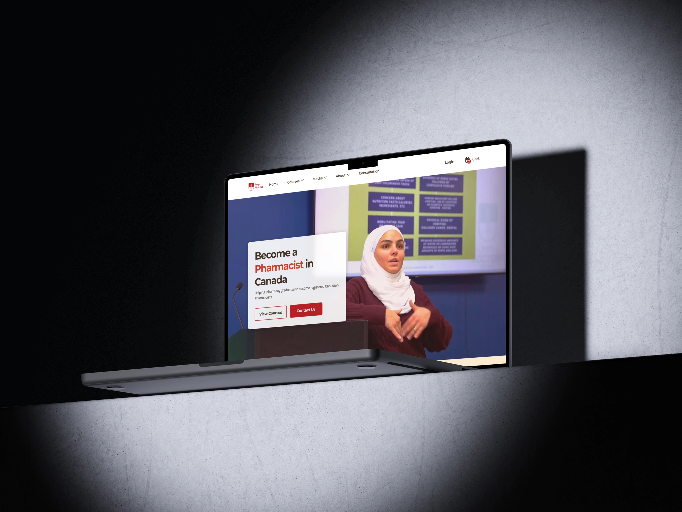
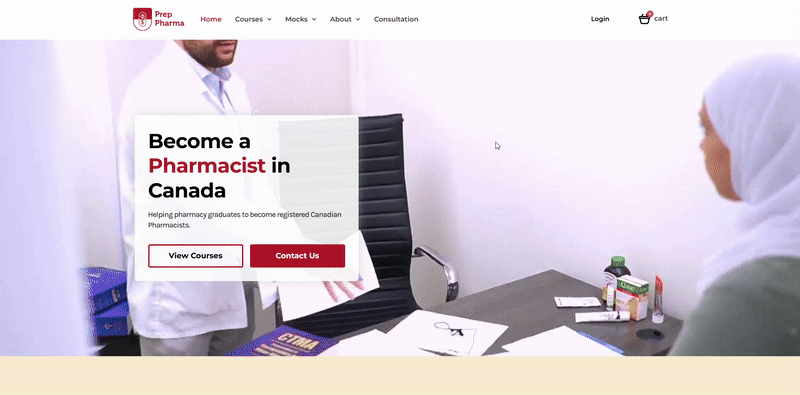
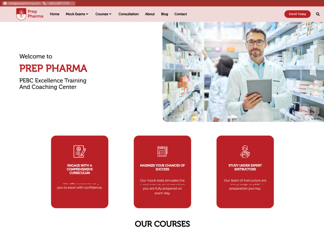
Redesigned the Web Experience and Helping Canadian and International Pharmacy Students Succeed in Their Pharmacy Examining Board of Canada (PEBC) Exams.
Result: site traffic increased by 200% and gotten positive feedback from students that were interacting with instructors.
Feedback: "The website is very modern compared to other (companies) and instantly drew me into learning more about the offered courses!"

problem
My task was to redesign the Prep Pharma website within a month with other ongoing projects. The design had to resemble the current prepdoctors.ca website so it keeps the looks and the feels of the website and feels "on brand". There was no design system created for the Prep Doctors website, so I had to create a lot from scratch in a short period of time.
Problem: How do I redesign with reasonable quality AND feels "on brand" AND within the deadline?
Tools
- Figma
- Wordpress
My Role
- UX design
- UX research
- Design System Creation
Timeline
- Given: 5 weeks
- Discovery & Research: 1 week
- Design & testing: 3 weeks
TASK - research
I had a chance to meet the Director of Prep Pharmacy to learn more about the overall scope of the project and learn about the PEBC (The Pharmacy Examining Board of Canada) process as well.
Key takeaways:
- Quickly learned the key salespoint and pain points of our current website.
- Learned overall process of obtaining Pharmacy Certificate for Canada and brainstormed easy infographic for both informative and strong CTA.
- Obtained design preference of stakeholders by showcasing 3 different webpages.
- Learned few of our big competitors and learned their sale point and what is appealing for pharmacy students and current pharmacists.
TASK - dESIGN system
- Design Planning
- I first started by gathering assets for the website - old website was full of stock photos, which both me, CTO and director of Prep Pharma agreed to remove and replace with our current materials.
- Then, I have obtained Figma file for the main company website, which unfortunately did not have a design system. I also obtained the existing brand guideline and logos.
- After obtaining information about the content and design, I have planned to redesign by these steps:
- Create the site architecture and get confirmation for less back-and-forth.
- Learn limitations of WordPress development by communicating with our developer.
- Edit a design system to fit the brand guideline given.
- Rapidly create versions for pages that could be created as a template (home, course, consultation and cart page) by utilizing design system components.
- Leverage as much design elements as possible from the main company's website for the branding familiarity.
- Do A/B testing with stakeholders and create final version
TASK - design system
Design System
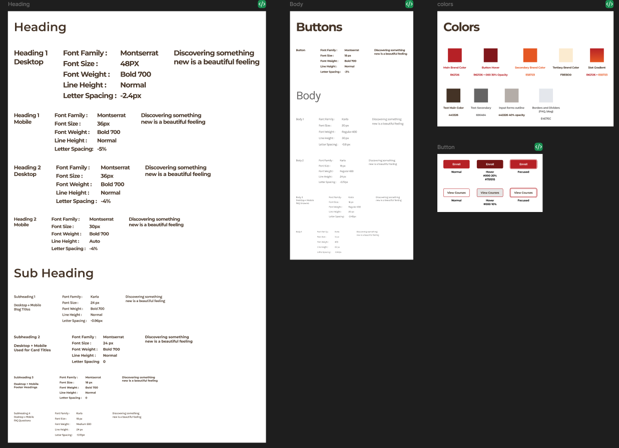
Based on the given time and resource, I have created a very small design system by utilizing Figma styles and variables. I have also utilized untitled ui library for faster design hand-off by customizing components to fit our branding.
This is a documentation for easier references in development and a great ground point for flexibility of the bigger scope in the future as well.
TASK - Handoff
Developer Handoff
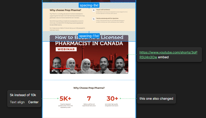
I cannot share too much details in public, but I have annotated sections by utilizing Figma annotations to showcase links, and highlight sections for specific details.
For example, I showcase what links to embed, and if there were differences between development and design, I highlight the specific spacing/colors for easier communication.
For changes of content, I alert the developer and showcase what specifically changed by annotation as well.
before
after
action
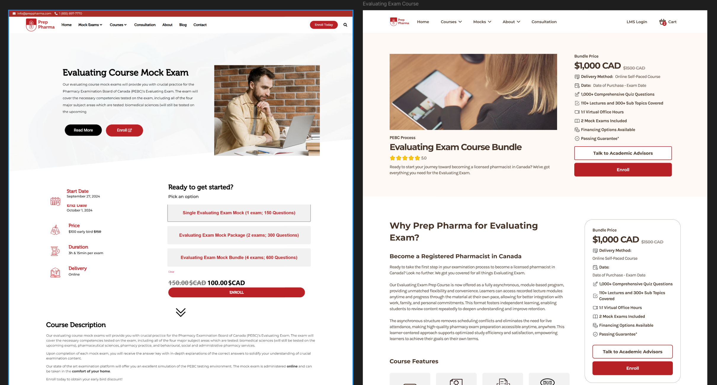
Page Optimization
The top bar is where most people spend their time on until they bounce away from the website.
With this data, I made sure that:
The content is readable in bite size with helpful icons
Added review sections to ensure trust that leads to purchase
Added “Talk to Academic Advisory” button that leads to consultation for higher conversion
Edited the page with heatmap data - retention rate of the header was 80-89% below the first fold, so made sure all the details of the course could be captured at the first section before users even scroll.
Made sure enroll button actually takes users straight to cart instead of scrolling down all the way to the bottom for options.
before
after
action
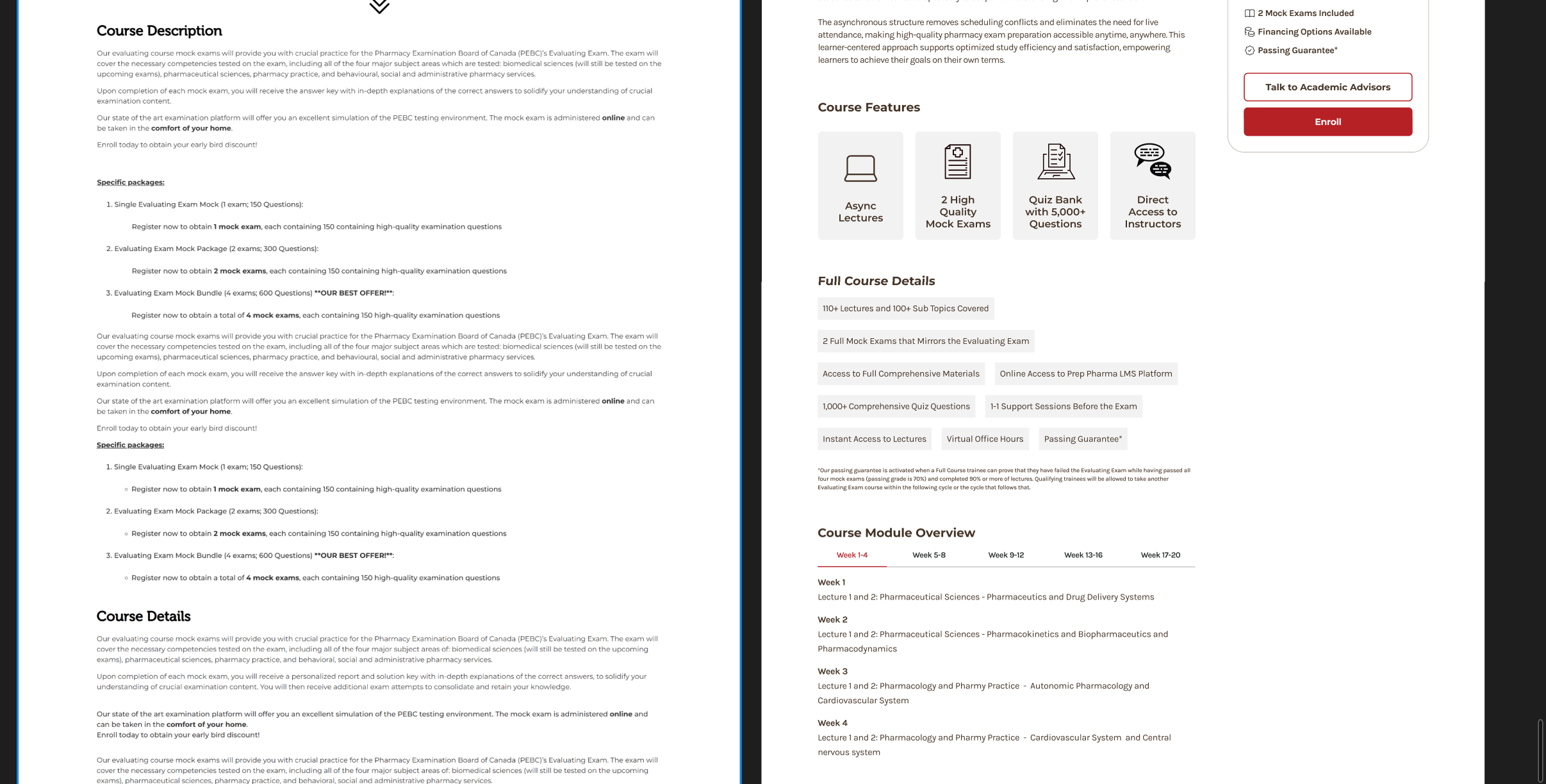
Content Optimization
Separated long copy to biteable, readable content with breather spacing to make sure people can read and understand the course details by skimming through the page. Also made checkout easier with floating menu bar at the side that scrolls down together while on scroll.
Added “Talk to academic advisor” button since the prices are pretty high for no-thought purchase ($1000-3000 CAD), so people can talk to our sales team and have that person to person trust that will lead to purchase. Also acts as a good sales funnel for people that need that second thought.
before
after
action
Checkout Optimization
- Made sure icons are not broken and changed the font to make it consistent with the branding
- Edited the design so the information that the user scans the most is easily skimmable with 1 line
Result
Result: site traffic increased by 200% and gotten positive feedback from students that were interacting with instructors.Conversion rate boosted to 120% with more organic views of 1000+ monthly visitors.
Feedback: "The website is very modern compared to other (companies) and instantly drew me into learning more about the offered courses!"


Solution
Redesigned the Web Experience and Helping Canadian and International Pharmacy Students Succeed in Their Pharmacy Examining Board of Canada (PEBC) Exams.
Result: site traffic increased by 200% and gotten positive feedback from students that were interacting with instructors.
Feedback: "The website is very modern compared to other (companies) and instantly drew me into learning more about the offered courses!"

problem
My task was to redesign the Prep Pharma website within a month with other ongoing projects. The design had to resemble the current prepdoctors.ca website so it keeps the looks and the feels of the website and feels "on brand". There was no design system created for the Prep Doctors website, so I had to create a lot from scratch in a short period of time.
Problem: How do I redesign with reasonable quality AND feels "on brand" AND within the deadline?
Tools
- Figma
- Wordpress
My Role
- UX design
- UX research
- Design System Creation
Timeline
- Given: 5 weeks
- Discovery & Research: 1 week
- Design & testing: 3 weeks
TASK - research
I had a chance to meet the Director of Prep Pharmacy to learn more about the overall scope of the project and learn about the PEBC (The Pharmacy Examining Board of Canada) process as well.
Key takeaways:
- Quickly learned the key salespoint and pain points of our current website.
- Learned overall process of obtaining Pharmacy Certificate for Canada and brainstormed easy infographic for both informative and strong CTA.
- Obtained design preference of stakeholders by showcasing 3 different webpages.
- Learned few of our big competitors and learned their sale point and what is appealing for pharmacy students and current pharmacists.
TASK - dESIGN system
- Design Planning
- I first started by gathering assets for the website - old website was full of stock photos, which both me, CTO and director of Prep Pharma agreed to remove and replace with our current materials.
- Then, I have obtained Figma file for the main company website, which unfortunately did not have a design system. I also obtained the existing brand guideline and logos.
- After obtaining information about the content and design, I have planned to redesign by these steps:
- Create the site architecture and get confirmation for less back-and-forth.
- Learn limitations of WordPress development by communicating with our developer.
- Edit a design system to fit the brand guideline given.
- Rapidly create versions for pages that could be created as a template (home, course, consultation and cart page) by utilizing design system components.
- Leverage as much design elements as possible from the main company's website for the branding familiarity.
- Do A/B testing with stakeholders and create final version
TASK - dESIGN system
Design System
Based on the given time and resource, I have created a very small design system by utilizing Figma styles and variables.
This is a documentation for easier references in development and a great groundpoint for flexibility as well.
TASK - Handoff
Developer Handoff
I cannot share too much details in public, but I have annotated sections by utilizing Figma annotations to showcase links, and highlight sections for specific details.
For example, I showcase what links to embed, and if there were differences between development and design, I highlight the specific spacing/colors for easier communication.
For changes of content, I alert the developer and showcase what specifically changed by annotation as well.
before
after
action
Page Optimization
The top bar is where most people spend their time on until they bounce away from the website.
With this data, I made sure that:
The content is readable in bite size with helpful icons
Added review sections to ensure trust that leads to purchase
Added “Talk to Academic Advisory” button that leads to consultation for higher conversion
Edited the page with heatmap data - retention rate of the header was 80-89% below the first fold, so made sure all the details of the course could be captured at the first section before users even scroll.
Made sure enroll button actually takes users straight to cart instead of scrolling down all the way to the bottom for options.
before
after
action
Content Optimization
Separated long copy to biteable, readable content with breather spacing to make sure people can read and understand the course details by skimming through the page. Also made checkout easier with floating menu bar at the side that scrolls down together while on scroll.
Added “Talk to academic advisor” button since the prices are pretty high for no-thought purchase ($1000-3000 CAD), so people can talk to our sales team and have that person to person trust that will lead to purchase. Also acts as a good sales funnel for people that need that second thought.
before
after
action
Checkout Optimization
- Made sure icons are not broken and changed the font to make it consistent with the branding
- Edited the design so the information that the user scans the most is easily skimmable with 1 line
Result
Result: site traffic increased by 200% and gotten positive feedback from students that were interacting with instructors.Conversion rate boosted to 120% with more organic views of 1000+ monthly visitors.
Feedback: "The website is very modern compared to other (companies) and instantly drew me into learning more about the offered courses!"
HOME
About
graphic
resume
contact

MADE WITH <3

Solution
Redesigned the Web Experience and Helping Canadian and International Pharmacy Students Succeed in Their Pharmacy Examining Board of Canada (PEBC) Exams.
Result: site traffic increased by 200% and gotten positive feedback from students that were interacting with instructors.
Feedback: "The website is very modern compared to other (companies) and instantly drew me into learning more about the offered courses!"

problem
My task was to redesign the Prep Pharma website within a month with other ongoing projects. The design had to resemble the current prepdoctors.ca website so it keeps the looks and the feels of the website and feels "on brand". There was no design system created for the Prep Doctors website, so I had to create a lot from scratch in a short period of time.
Problem: How do I redesign with reasonable quality AND feels "on brand" AND within the deadline?
Tools
- Figma
- Wordpress
My Role
- UX design
- UX research
- Design System Creation
Timeline
- Given: 5 weeks
- Discovery & Research: 1 week
- Design & testing: 3 weeks
TASK - research
I had a chance to meet the Director of Prep Pharmacy to learn more about the overall scope of the project and learn about the PEBC (The Pharmacy Examining Board of Canada) process as well.
Key takeaways:
- Quickly learned the key salespoint and pain points of our current website.
- Learned overall process of obtaining Pharmacy Certificate for Canada and brainstormed easy infographic for both informative and strong CTA.
- Obtained design preference of stakeholders by showcasing 3 different webpages.
- Learned few of our big competitors and learned their sale point and what is appealing for pharmacy students and current pharmacists.
action - design planning
Design Planning
I first started by gathering assets for the website - old website was full of stock photos, which both me, CTO and director of Prep Pharma agreed to remove and replace with our current materials.
Then, I have obtained Figma file for the main company website, which unfortunately did not have a design system. I also obtained the existing brand guideline and logos.
After obtaining information about the content and design, I have planned to redesign by these steps:
- Create the site architecture and get confirmation for less back-and-forth.
- Learn limitations of WordPress development by communicating with our developer.
- Edit a design system to fit the brand guideline given.
- Rapidly create versions for pages that could be created as a template (home, course, consultation and cart page) by utilizing design system components.
- Leverage as much design elements as possible from the main company's website for the branding familiarity.
- Do A/B testing with stakeholders and create final version
TASK - design system
Design System
Based on the given time and resource, I have created a very small design system by utilizing Figma styles and variables. I have also utilized untitled ui library for faster design hand-off by customizing components to fit our branding.
This is a documentation for easier references in development and a great ground point for flexibility of the bigger scope in the future as well.
TASK - Handoff
Developer Handoff
I cannot share too much details in public, but I have annotated sections by utilizing Figma annotations to showcase links, and highlight sections for specific details.
For example, I showcase what links to embed, and if there were differences between development and design, I highlight the specific spacing/colors for easier communication.
For changes of content, I alert the developer and showcase what specifically changed by annotation as well.
before
after
action
Page Optimization
The top bar is where most people spend their time on until they bounce away from the website.
With this data, I made sure that:
The content is readable in bite size with helpful icons
Added review sections to ensure trust that leads to purchase
Added “Talk to Academic Advisory” button that leads to consultation for higher conversion
Edited the page with heatmap data - retention rate of the header was 80-89% below the first fold, so made sure all the details of the course could be captured at the first section before users even scroll.
Made sure enroll button actually takes users straight to cart instead of scrolling down all the way to the bottom for options.
before
after
action
Content Optimization
Separated long copy to biteable, readable content with breather spacing to make sure people can read and understand the course details by skimming through the page. Also made checkout easier with floating menu bar at the side that scrolls down together while on scroll.
Added “Talk to academic advisor” button since the prices are pretty high for no-thought purchase ($1000-3000 CAD), so people can talk to our sales team and have that person to person trust that will lead to purchase. Also acts as a good sales funnel for people that need that second thought.
before
after
action
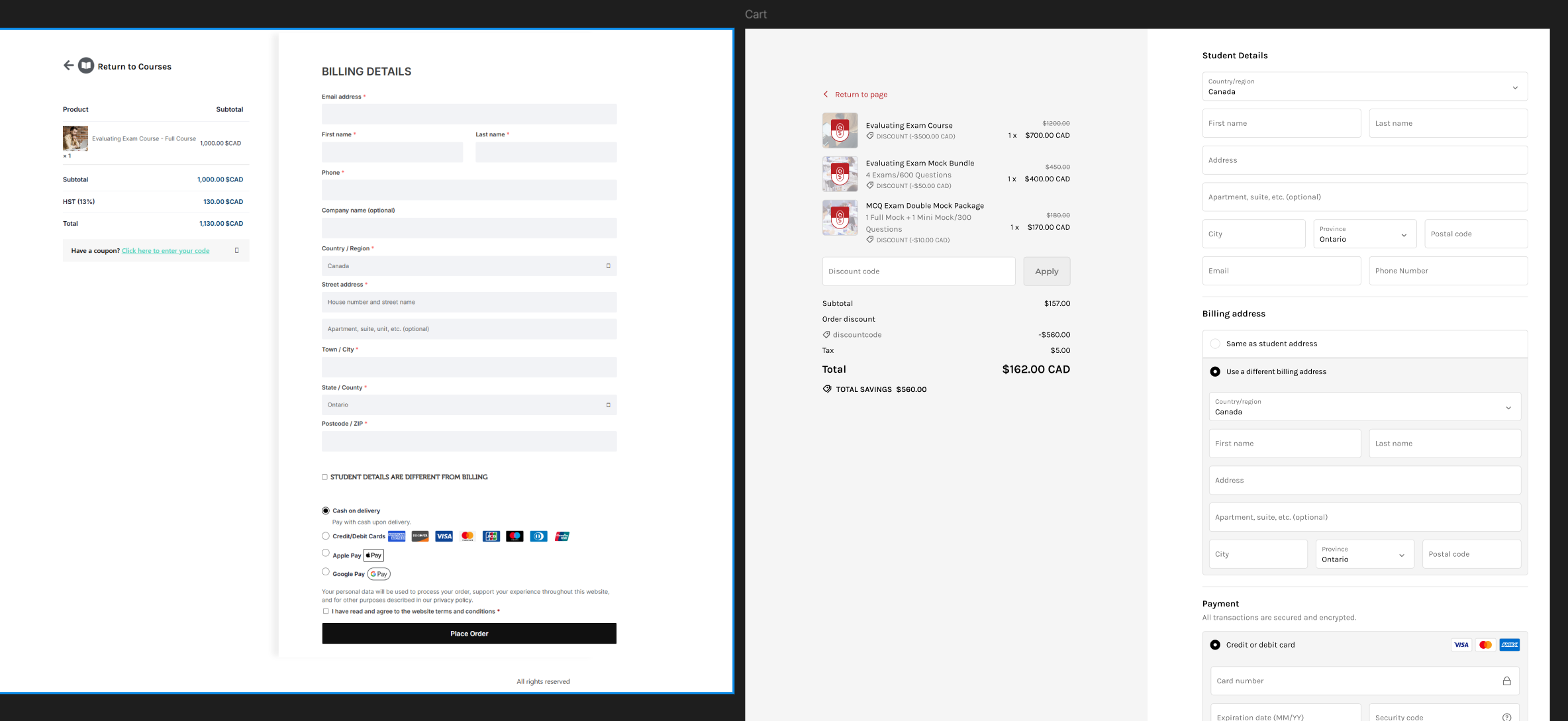
Checkout Optimization (right side is new UI)
- Made sure icons are not broken and changed the font to make it consistent with the branding
- Edited the design so the information that the user scans the most is easily skim-able within seconds
- Made sure the input fields are standardized and fit the branding
- Changed the order so the student information is inputted first (and then if billing is different, they can choose to input a different info and address)
- Cleaned up UI by leveraging Shopify’s UI guidelines so it looks polished and presentable for trust.
Result
Result: site traffic increased by 200% and gotten positive feedback from students that were interacting with instructors.Conversion rate boosted to 120% with more organic views of 1000+ monthly visitors.
Feedback: "The website is very modern compared to other (companies) and instantly drew me into learning more about the offered courses!"
HOME
About
graphic
resume
contact

MADE WITH <3
